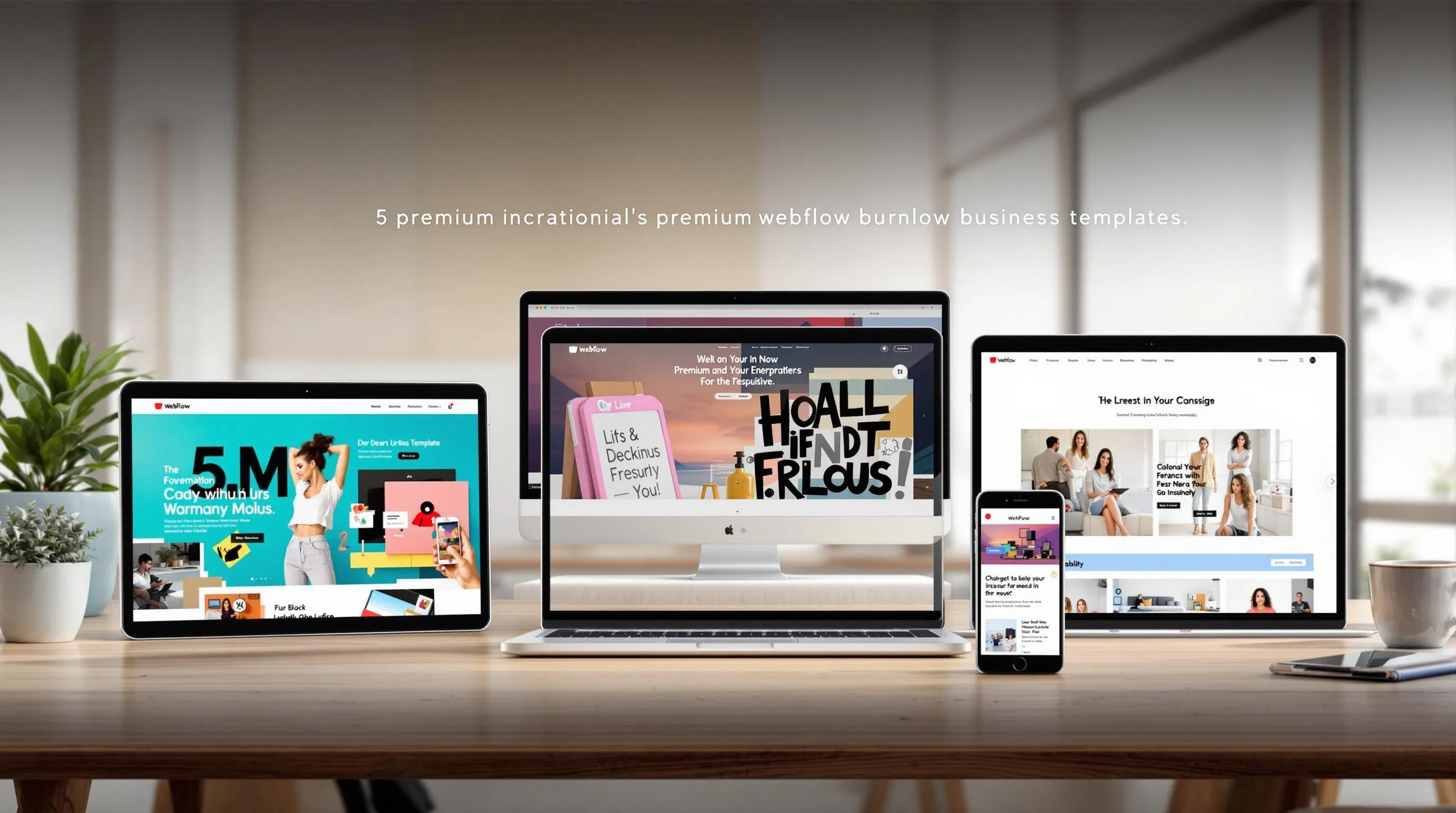
5 Common Website Template Mistakes to Avoid

Website templates make building websites faster and cheaper, but they can lead to problems if not used properly. Here are the five most common mistakes and how to fix them:
-
Poor Mobile Design: Over 62% of global web traffic is mobile, so neglecting mobile optimization can hurt user experience and performance.
- Fix: Use responsive design, touch-friendly buttons, and simplified navigation.
-
Too Many Features: Overloading your site with features slows it down, with 40% of visitors leaving if a page takes more than 3 seconds to load.
- Fix: Remove unnecessary plugins, simplify navigation, and compress media files.
-
Missing Brand Elements: Using a generic template without customizing it weakens your brand’s identity.
- Fix: Add your brand’s colors, fonts, and visuals for consistency.
-
Bad Website Navigation: Confusing menus frustrate users, driving away up to 55% of visitors.
- Fix: Simplify menus, use clear labels, and optimize for mobile.
-
Poor Content Planning: Placeholder text and unorganized content harm SEO and confuse users.
- Fix: Plan content early, use real text, and focus on user needs.
Quick Tip: Address these mistakes to improve user experience, boost SEO, and make your website more effective.
Top 5 Webflow Mistakes Beginners Make
Mistake #1: Poor Mobile Design
Neglecting mobile optimization can hurt your website's performance. With mobile devices making up over 62.71% of global web traffic as of January 2025, ignoring mobile design could mean losing up to 90% of your audience.
Common Issues with Mobile Layout
Many website templates struggle to provide a smooth experience for mobile users. These are some frequent problems:
| Issue | Impact |
|---|---|
| Slow Loading | 53% of users leave sites that take over 3 seconds to load. |
| Tiny Buttons | Buttons smaller than 48x48 pixels frustrate users. |
| Unreadable Text | Forces users to zoom, increasing bounce rates by up to 40%. |
| Complex Navigation | Confuses users, leading to abandonment on smaller screens. |
| Oversized Images | Slows page loading and uses excessive mobile data. |
Making these fixes can greatly improve user experience.
How to Fix Mobile Display Problems
Here’s how you can tackle these mobile issues:
Responsive Design
Make your site adaptable to any screen size with fluid grids and flexible layouts. Use Scalable Vector Graphics (SVGs) to ensure images look sharp on all devices.
Touch-Friendly Elements
Design buttons and links that are easy to tap. They should be at least 48x48 pixels in size. Space them out to avoid accidental clicks.
Content Layout
Structure content vertically, placing the most important information at the top. Break text into shorter paragraphs, use clear headings, and enable lazy loading for images to speed up page performance and save data.
Simplified Navigation
Incorporate hamburger menus, limit menu items, and make interactive elements easily accessible. Avoid unnecessary pop-ups to reduce user frustration.
With mobile devices expected to account for over 75% of all eCommerce sales in 2025, these changes are critical for staying competitive.
Mistake #2: Too Many Features
While improving mobile design can fix interface problems, overloading your site with features can hurt its performance. Too many features can slow down your site, and that's a big deal - 40% of visitors leave a website if it takes more than 3 seconds to load.
Signs of Feature Overload
Feature overload is often easy to spot. For instance, every third-party script you add increases page load time by about 34.1 milliseconds. Here are some common warning signs:
| Warning Sign | Impact on Website |
|---|---|
| Slow Loading Speed | 7% drop in conversions per second of delay |
| Complex Navigation | 35% lower conversion rates |
| Multiple Plugins Active | 34.1ms added per third-party script |
Simplifying Your Templates
"Most of the cost for a feature is not in the initial development but in the long-tail of time after it is launched."
To avoid feature bloat, take these steps:
- Audit features regularly: Remove or combine features that users rarely interact with.
- Review plugins and scripts: Get rid of those that don’t add real value.
- Simplify navigation: A clear structure makes it easier for users to find what they need.
As Luke Wroblewski, a Product Director at Google, puts it:
"In the era of mobile and speed, simplicity wins. Users prefer experiences that prioritize clarity and ease."
Practical Tips for Streamlined Design
- Remove decorative elements that serve no purpose.
- Keep menu options to only the most important pages.
- Compress media files to improve load times.
- Stick to a single, straightforward navigation menu.
- Test features often to ensure they’re still useful.
"We obsess over removing friction and making each interaction feel effortless. Simplicity is the ultimate sophistication."
sbb-itb-fdf3c56
Mistake #3: Missing Brand Elements
Using a website template without tailoring it to your brand can make your site feel generic and disconnected from your company’s identity.
Template Design Mismatches
Many businesses stick with template defaults that don’t align with their brand guidelines. Sara Mote, Creative Director at Mote, highlights the importance of this connection:
"A website is definitely an opportunity to invite others to connect with your brand or company on a deeper level, one that feels really personal and emotional rather than purely transactional".
Here are some common branding inconsistencies and their potential impact:
| Branding Element | Impact of Poor Implementation |
|---|---|
| Color Palette | Weakens brand recognition |
| Typography | Hinders message clarity and engagement |
| Visual Assets | Creates a fragmented experience across platforms |
| Content Voice | Sends mixed messages about your brand |
Addressing these issues can help establish a stronger and more cohesive brand identity.
Adding Your Brand Identity
Customizing your website template is key to making it feel like a true extension of your brand. Focus on these core areas:
Color Implementation
Set your brand’s colors in the global styles of your template. Stick to a palette of no more than six colors. Use a dominant color for key elements, a standard color for text, and two accent colors for highlights or calls-to-action.
Typography Customization
As Sara Mote explains:
"Every single font has its own story and inspiration. It's the subtle nuances within the letterforms that give a distinctive voice and tone that strengthen a brand's identity."
Swap out default fonts for your brand’s typefaces. Ensure they’re easy to read across different devices and establish a clear font hierarchy for consistency.
Visual Elements Integration
Take full advantage of your template’s customization options to reflect your brand. Templates like Rosalia ($129) and AnderDark ($79) offer built-in features to help with this process.
Technical Considerations
- Test color contrast ratios (minimum 4.5:1) to ensure readability and accessibility.
- Pair color cues with iconography and text labels to make your site more user-friendly.
These adjustments can transform a basic template into a website that truly represents your brand.
Mistake #4: Bad Website Navigation
Poor navigation can seriously hurt your website's performance. Research shows that confusing menu structures can drive away up to 55% of visitors. This issue is often worse when using templates, as their default navigation setups may not suit your specific needs.
Common Navigation Issues
Templates often come with pre-set navigation that can create problems for users:
| Navigation Issue | Impact on Users | Fact |
|---|---|---|
| Non-standard menu placement | Makes finding information slower | 38% of users focus on navigation links first |
| Unclear hamburger icons | Causes confusion, especially for older users | 48% of users over 45 may not recognize the icon |
| Too many menu items | Overwhelms and frustrates users | More than 7 items can overwhelm users |
| Poor mobile optimization | Leads to higher bounce rates | Mobile-friendly navigation is critical |
These problems can directly lower user engagement, making it essential to address them effectively.
"The design of a website's navigation has a bigger impact on success or failure than almost any other factor. It affects traffic and search engine rankings. It affects conversions and user-friendliness."
How to Improve Navigation
Here are some actionable strategies to fix navigation issues:
- Simplify Your Menu: Stick to seven or fewer items to avoid overwhelming users.
- Focus on Mobile: Ensure clickable elements are at least 44×44 CSS pixels to improve usability on mobile devices.
-
Strategic Placement: Place key navigation elements where users naturally look:
- Main navigation in the header
- Utility links (like login or support) above the primary menu
- Contact details in the top-right corner - used by 55% of marketing sites
- A prominent search bar for content-heavy sites
"Effective website navigation is essential for delivering a seamless user experience. It is the backbone of your site's design, guiding visitors effortlessly to the information they seek."
- Use Visual Hierarchy: Add whitespace, contrasting colors, and clear indicators (like breadcrumbs) to make multi-level menus easier to follow.
-
Enhance Functionality:
- Use sticky navigation for long pages.
- Include tappable phone numbers in mobile menus.
- Add a search feature for large websites.
Finally, test regularly. Tools like Google Analytics can reveal navigation patterns and highlight areas that need improvement. Use real user data to tweak your structure rather than relying on assumptions.
Mistake #5: Poor Content Planning
Many website creators prioritize design over content, which can cause major headaches down the line. Research shows that a simple webpage with high-quality content often outperforms a flashy design filled with placeholder text.
Why Placeholder Content Causes Problems
Using placeholder text can lead to several issues:
| Issue | Impact | Recommended Approach |
|---|---|---|
| Mismatched Layout | The design may not fit the actual content | Design layouts based on real content |
| SEO Challenges | Placeholder text can harm search engine rankings | Incorporate keyword-rich content early |
| Brand Disconnect | Generic text lacks your brand's personality | Create messaging that reflects your brand |
| User Confusion | Placeholder text can mislead or confuse visitors | Replace temporary text before launch |
The solution? Start with a clear, organized content plan.
"We need to start urging our clients to think about their content not just as a commodity, but as the starting point, the building blocks of a website. It's time to stop building the house without knowing how many bedrooms it may need. Because you know what they call things that are beautiful, but have no function? Useless."
Steps for Effective Content Planning
-
Develop a Content Strategy
Outline your goals, target audience, content structure, and key SEO terms. -
Create Real Content Early
"The layout should be built around the content, not the other way around."
-
Set Up a Content Calendar
Plan a timeline for content creation, updates, and SEO improvements."Prior to content prioritization, it is important to do an internal audit as well as a competitor analysis... For the competitor analysis, I suggest picking the top 5 direct competitors and looking at: their site structure, top keywords, organic traffic, backlinks (Ahrefs), content quality, E-E-A-T signals, and Share of Voice."
Additional tips to keep in mind:
- Think Mobile First: Ensure your content is easy to read on all devices.
- Address User Needs: Focus on solving your visitors' problems.
- Stay Consistent: Align all content with your brand's voice and messaging.
- Test with Real Text: Use actual content during layout testing.
A well-thought-out content strategy ensures your design complements your message. As Rian van der Merwe puts it:
"The design is the packaging for the content. If you design the packaging first, you're doing so without knowing what's going into it. When, inevitably, the content doesn't fit the packaging, you must either start over with a new design, or alter the content to make it fit by sacrificing some parts or adding filler."
Conclusion: Making Better Template Websites
Design plays a major role in first impressions - 94% of them, to be exact. For template websites to succeed, careful planning and smart execution are essential.
Common Mistakes and How to Fix Them
| Mistake | Solution |
|---|---|
| Poor Mobile Design | Use responsive design |
| Feature Overload | Keep layout and features simple |
| Missing Brand Elements | Ensure consistent visual identity |
| Bad Navigation | Build intuitive user paths |
| Poor Content Planning | Create a clear content strategy |
Key Takeaways
Addressing these challenges can help create a smooth, user-centered website experience.
Kristopher Tabaie explains:
"Good web design is about more than just aesthetics. It involves a user-friendly layout, clear navigation, and a clean interface that clearly communicates the content. This makes your website accessible (internally and externally to search engines) by creating an easy-to-navigate experience."
Steps to Improve Template-Based Websites
-
Prioritize Mobile Performance
With over half of all website traffic coming from smartphones, mobile-first design is a must. -
Boost Loading Speed
- Use tools like file compression, lazy loading, and CDNs to improve performance.
-
Test and Measure
Petar Starcevic highlights:"Once people are actually using your website, it's important to measure everything and get concise data to drive business development, and design & technical development of the website."
Related Blog Posts
Recommended posts